
Just a few days ago, Pantone, the color authority for the design world, announced it’s 2012 Color of the Year: Tangerine Tango.
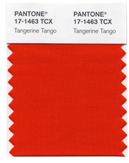
Here’s what they say about it in the press release: “Sophisticated but at the same time dramatic and seductive, Tangerine Tango is an orange with a lot of depth to it,” said Leatrice Eiseman, executive director of the Pantone Color Institute®. “Reminiscent of the radiant shadings of a sunset, Tangerine Tango marries the vivaciousness and adrenaline rush of red with the friendliness and warmth of yellow, to form a high-visibility, magnetic hue that emanates heat and energy.” (read the entire press release here.)
Dramatic? I think maybe that’s an understatement. So what’s the average homeowner to do with this? Where -- and how -- could you use such a color as Tangerine Tango?
My immediate thought was in a powder room, a small bath with little or no light, so that the color itself would illuminate the room. Picture it with a dark espresso vanity, a light golden granite, and lots of bright silvery-chrome fixtures and accents. Add a crystal chandelier and it would be like being inside a very special jewel box. Or, in a more modern setting, I could see it as an accent wall in a family or media room, with all the other walls painted a cool grey, and a huge white leather sectional anchored by a graphic black and white area rug. Want something cozier? How about a den or library with rich, dark chocolate brown walls, a deep cushioned sofa you could sink into, and Tangerine Tango layered -- as trim on the mocha-colored natural silk draperies, in the pattern on the throw pillows, picked up again in the vibrant yet soothing tonalities of the Gustav Klimt print on the wall. Lovely.
No comments:
Post a Comment